Over the years, I’ve presented on reporting medical research findings. Some of the most common questions I get are about writing the findings using accessible language that an average person can understand. It’s particularly difficult when the outcome is reported in units like standard deviations, but reporting hazard ratios and odds ratios can be confusing as well, especially for those who only occasionally write about medical studies.
A new resource from the Winton Centre for Risk and Evidence Communication at Cambridge University in the UK can help you make sense of those findings and even provide the language and graphics to help your audience understand the results. RealRisk is the brainchild of professor David Spiegelhalter, the center’s chair, a statistician and author of The Art of Statistics, and Executive Director Alexandra Freeman, who told me more about the tool.
“When you’re communicating scientific research to a general audience, it can be very challenging to do it in a way that helps them understand its meaning and its importance,” Spiegelhalter says in a video on the RealRisk homepage. “So we’ve created this tool, RealRisk, that takes the numbers used in scientific studies and turns them into graphics and sentences that everyone should be able to make better sense of.”
Here’s how it works, with additional notes from me:
1) Identify a piece of medical or social science research. Note: This primarily works on observational studies or randomized controlled studies with a clear, singular exposure and outcome. If there are multiple exposures or outcomes, you would need to enter them separately later in the process.
2) Make sure the results are reported in one of the following units: hazard ratios, odds ratios, relative risk (including risk ratio and rate ratio) or percentage change. Note: If the findings aren’t reported with one of these, RealRisk can’t be as helpful (at least currently).
3) Pick the outcome, finding or result that you want to communicate. Go to the RealRisk homepage and click “Get the real risk” to enter details from the study.
4) Be prepared to enter the following:
- The population(s) studied. The program only provides room for a single population, so you may have to go through it a couple of times to look at different exposures or outcomes for different populations in the study. The program is also binary — comparing one group to one other group — so it wouldn’t work for comparing more than two groups to each other.
- The risk factor being investigated. In my opinion, this language is a bit confusing and should be “exposure” instead. That’s because “risk factor” in this context could refer to a real risk factor (such as smoking) or a medical intervention (medication or other therapy) or a protective factor (such as physical activity or eating vegetables). “Risk factor,” therefore, is interpreted pretty loosely, so I hope this eventually changes to “exposure” or “risk factor/exposure/medication/therapy/protective factor” or something similar.
- The outcome being studied. This is straightforward as long as there’s a single outcome.
- The finding in relative risk, hazard ratio, percentage change or odds ratio.
- Condition in the baseline group and the experimental or comparison group. The baseline group is the control group in RCTs. It asks for the absolute risk, so be sure you can find that in the study — even if you have to look at a table to find it.
- Baseline risk. This typically is the same number as in the control group, except perhaps in unusual studies. Spiegelhalter emphasizes in the video that this number is the lynchpin for the tool to work. “Baseline risks can be tricky to find, but they are the key to communicating this stuff well and, so, worth the effort,” he says.
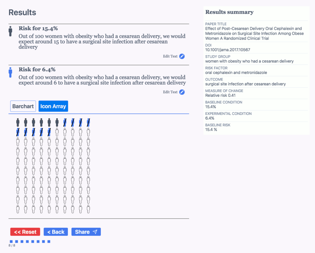
The tool then shows you a page containing bar charts, an icon array and sentences you can use to communicate risks. They may require a little editing, but they do pretty well. I will say that this tool is pretty basic. If you’ve been covering medical research for a while, the sentences may not help much, but I loved the icon array as a free graphic, which is probably the biggest reason I’ll use this tool.
Below is an example I tried with a 2017 study called “Effect of Post-Cesarean Delivery Oral Cephalexin and Metronidazole on Surgical Site Infection Among Obese Women: A Randomized Clinical Trial:”
RealRisk: Which group or groups are studied in this paper?
My answer: women with obesity who had a cesarean delivery
RR: What risk factor is being investigated?
A: oral cephalexin and metronidazole
RR: What outcome is being investigated?
A: surgical site infection after cesarean delivery
Relative risk: 0.41
Hazard ratio:
Percentage change:
Odds ratio:
RR: Condition in Baseline Group:
A: 15.4%
RR: Condition in Experimental or Comparison Group:
A: 6.4%
RR: Baseline Risk
A: 15.4%
Below is what it provided me. Again, it’s pretty basic, but it could be invaluable for those who are new to covering studies, don’t cover them often, or need a graphic illustration of the results.


