 When the federal government in June began to post a series of maps that showed how many health insurers would participate in the marketplaces set up by the Affordable Care Act, reporters quickly noted that one key element was missing from the posts: the data.
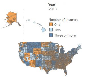
Health care journalists across the country sent inquiries to the Centers for Medicare and Medicaid Services requesting the numbers behind the weekly health insurance coverage maps, which projected how many insurers would make options available, county-by-county, for 2018.
Some posted the maps without the data. But frustration mounted among others, whose requests for details were denied or ignored, even as the agency instituted major changes to open enrollment that would affect millions of Americans planning to shop for health plans.
“This is, at best, weird,” wrote MedPage Today staff writer Matt Wynn in an August post in which he called attention to both the lack of data and CMS’ unusual responses to his requests for clarity. “At worst, it raises questions about CMS intentions,” added Wynn, who questioned whether the aim was less about informing the public, and more about promoting a political agenda.
That post resonated with journalists across the country. Many had already expressed concern over what appeared to be a lack of responsiveness, an inability to reach key government officials, and limited access to information from federal agencies under the Trump administration.
In late September, during their quarterly call with HHS officials, members of AHCJ’s Right to Know Committee also requested all the data used to generate the 14 maps that it posted since June.
A month later, the agency provided links to downloadable raw datasets. They included the county-by-county data about which qualified health and dental plans would be sold on healthcare.gov and from which insurers. But they also included those plans’ quality ratings, as well as the essential health benefits, coverage limits and cost sharing subsidies they’d include.
“Releasing data is so important, because it allows us to provide context,” Wynn told the Right to Know Committee. “When we had maps with no supporting information, we couldn’t do that.”
But the delay came at the cost of public understanding.
As Wynn notes in his follow-up piece, when the data was finally available, the Kaiser Family Foundation provided a detailed analysis that shed new light on the situation.
The CMS maps showed which counties had just one insurer on the Obamacare exchanges, an increase from 33 percent to 52 percent. But by delving into the data, KFF showed that the number of people affected was much lower than those figures implied. Only 26 percent of Americans (up from 21 percent the previous year) lived in a county with only one Obamacare insurer.
In addition, a Washington Post analysis noted that no American was living in a community where an option for affordable individual health insurance coverage did not exist.
“We’re glad that the Right to Know Committee and other journalists were eventually able to pry the facts loose,” said Felice J. Freyer, AHCJ vice president and committee chair of the Right to Know Committee. “But it’s troubling that it took so long, especially when the lack of data prevented reporters from providing complete, nuanced reports. The Right to Know Committee will continue to fight for better – and faster – access to the facts.”
Have you encountered obstacles obtaining timely interviews or information needed in your health care reporting? Please get in touch with the Right to Know chair or vice chair at felice.freyer@globe.com or srice@dallasnews.com.