
It’s no secret that humans are horrible at comprehending and estimating risk, especially when it comes to abstract numbers. It’s one reason (of several) that people fear encountering sharks at the beach more than the undertows that can drown them.
Misperceptions of risk have become an even more urgent life-or-death issue during the pandemic as a substantial number of people attempt to downplay the fatality rate. The gambit they use is flipping the rate. Instead of saying that 0.5% of people die, they say that 99.5% of people survive, which makes it sound far less dangerous (as well as dismissing long-haulers’ experiences and the potential for long-term disability).
But as “self-appointed data police cadet” Nick Brown points out in a recent Twitter thread, 99.5% represents odds that most people wouldn’t take if they thought about it in different terms. (He also notes that discussing only fatality rates ignores other health costs of COVID-19 infection.) He notes that 99.5% also can be seen as a chance of dying of one in 200.
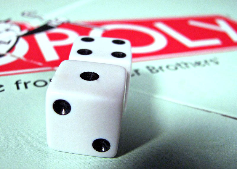
Brown’s thread provides some examples, using familiar, relatable images like board games. “In Monopoly, if you throw doubles (any doubles) three times in a row, you go to jail,” he writes. “One chance in 216 at the start of any turn. Anyone who has played Monopoly more than once has seen this. It’s common enough that they made a rule for it, after all.”
For those who don’t play Monopoly, he gives an example from the game Risk: “You are defending. Your opponent throws three sixes. Oops. One chance in 216.”
However, some of these examples are still abstract or, at the least, won’t mean much to people who don’t play those types of games. Brown then makes his examples even more personal and relatable: “Or think of something you do every day, and get wrong twice a year. Put your t-shirt on the wrong way round. Leave the keys on the counter when you go to get the car out. That sort of thing. Not once-in-a-blue-moon events, but they don’t affect you 99.5% of the time.”
As someone who probably wore one blue dress shoe and one black dress shoe to work when I taught high school about twice a year (I always got dressed in the dark), that one hit home.
Brown provides additional examples. “Now, let’s play a game,” he wrote. “I offer you a deal. It can be a bottle of champagne or your phone bill paid for a year, or your student loan debt wiped off, or your mortgage paid, or a massive yacht. You get that, but you roll three dice. If they all come up six, you die, right there.” He asks how much he’d have to offer for you to take that bet — and guesses it’s a lot more than your student loan debt.
These examples do a brilliant job of putting an abstract statistic in perspective for readers, something journalists can do every time they write about them. Imagine how some COVID-19 minimizers’ attitudes might shift if, whenever they read about the fatality rate, the article couches it in terms that are easy to visualize, using an analogy or metaphor to make it feel more real and personal.
Visual examples work particularly well, and Brown offers this example: “Think about 1,000 people accepting this deal. They’re gathered in a room. They step up to the stage, one by one. They take the envelope and roll the dice. 995 people get cheered. Five get led away. A muffled shot can be heard from behind the curtain.”
That example chilled me more than the roll-of-the-dice death bet because I can visualize it. In fact, it made me think of some pretty horrific events in history that probably enhanced my sense of doom by employing a bit of emotional manipulation.
I’m not suggesting journalists try to manipulate readers emotionally — that last example isn’t one that would likely pass muster with journalistic ethics unless it’s a quote from a source. But it certainly gets the point across. And you can always ask your sources to try to put numbers like these into perspective with an analogy.
As Brown points out, that 99.5% refers to the overall population’s fatality rate, not the much higher rate among older adults or those with certain health conditions. The rest of his thread is worth reading for additional context that journalists can use in articles or ask sources to provide. If we are to be successful, effective journalists, telling stories with facts about public health, we owe it to our readers to help them understand what the numbers in those facts really look like.