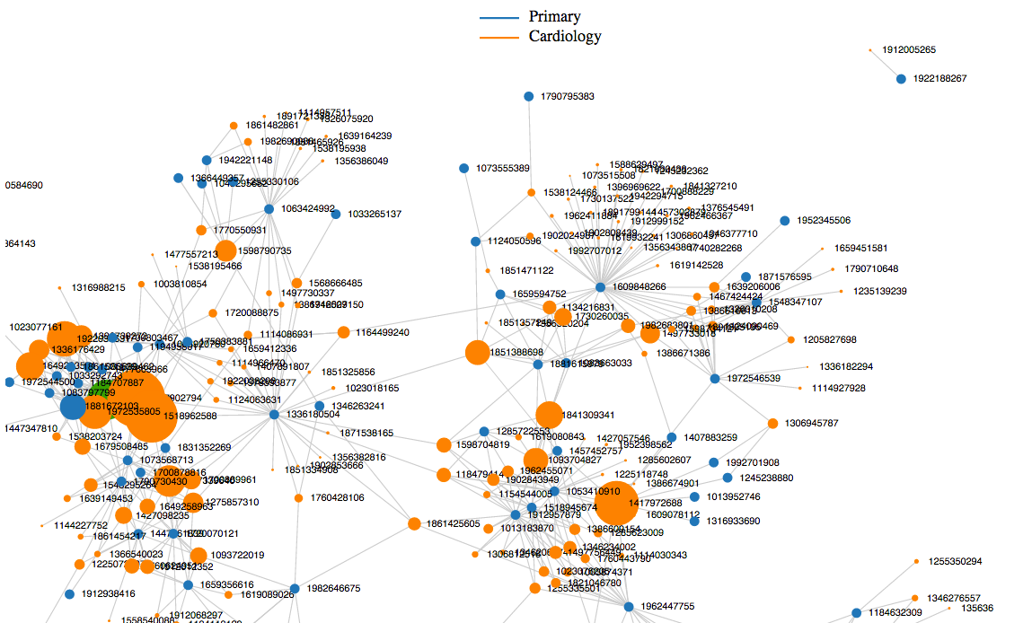
AHCJ member Fred Trotter publicly unveiled a major data set last week that could reshape how journalists report on medical professionals. At the Strata Rx conference in San Francisco, Trotter showed off data he received from the U.S. Centers for Medicare and Medicaid Services that could show the relationships among physicians, as well as their referral patterns.

Fred Trotter has agreed to let AHCJ members have access to his development website so they can look up specific doctors. To access it, click here and login to the AHCJ site.
Trotter plans to release the full data set and the search tool to the public at a later date (see below). Trotter answered some questions from AHCJ President Charles Ornstein:
Q. Tell us about the data set you just unveiled.
A. This is the social graph of medicine. It is the referral patterns for most of the doctors, hospitals and labs in the country, based on a FOIA request for Medicare data. For any given physician in the United States, there is a good chance that this data set reveals what other doctors, hospitals and labs they typically work with.
Q. How could it be useful for journalists?
A. Using the data, journalists will be able to figure out “who to gumshoe” for health care stories.
Some ideas:
● You have a “bad doctor” story. This works for crime, fraud, etc. Who was referring patients to that doctor, what hospital was he or she working with? At the least, the people you identify would be interesting to interview. At worst, these people may be co-conspirators.
● Who are the best doctors in your city? Who is the best local resource to interview about cardiology, neurology, etc. Specialists who have lots of inbound referrals from different doctors implicitly have the respect of other doctors in the community.
● By grouping doctors by hospital referrals, it will be possible to see which ones are “aligned” with different hospitals. It is also possible to measure how exclusive this affiliation is. Most local health care reporters have an intuition of how the local health care market operates, but this will provide specific details.
● By working with data scientists we can make lots and lots of pretty diagrams to support journalistic assertions.

Q. How hard was it to get the data? Did you have to jump through hoops?
A. It was extremely difficult. It took me about two years to get the data. First, I submitted a regional request to the wrong region. Then I submitted it to the right region but they decided that it was a national request. Then they wanted me to work through ResDAC. I tried that, but they required that I agree not to publicly release the results. Releasing the results was the whole point, so that did not work. Each of these steps took months. But eventually I got to the right place, and I complained loudly enough that I got the attention that I needed.
Most importantly, I spent a tremendous amount of time engineering my request so that it fully complied with a 1979 court injunction that barred the release of data about physician compensation from Medicare. The data that I have is not even remotely close to the most accurate referral data that could be calculated from the Medicare data set. The court injunction means that you cannot get data that can be used to calculate a doctor’s payments from Medicare. The simplest and most accurate way to create a “weighted” referral graph would be to show that primary care doc A was working on patient X with specialist B, and that B had performed $10k worth of procedures. But that would have triggered the injunction because it would have allowed me to accurately estimate the amount of money that doctor B was being paid. By avoiding this really accurate information, and asking for something simpler, I was able to get what I really wanted, which is the graph as a whole.
Q. Are there any drawbacks to the data set or things to keep in mind?
A. I will be writing an article soon that will detail exactly how the data was formed and what the resulting constraints are for interpretation, so I will provide a very specific answer to this question soon.
Until then, it is important to understand that this is a “weighted” graph, and the weight corresponds to the strength of the referral relationship. If two providers are connected by “20” referrals, then this could be random, it might not be a real connection. If two providers are connected by 1,000 referrals then they obviously are connected.
Given the way we calculated “referral,” every doctor who has patients in the emergency room “refers” those patients to the emergency room. Obviously this was not a real referral, but my data set treats “seeing the same patient in a short time frame” as a referral… so it looks like one in the data set.
Q. What do you mean by a referral? How do you know a doctor is referring to another provider?
In reality, I cannot detect explicit referrals in the data set. What I can detect is “doctors and organizations working on the same patient at roughly the same time.” This data set might be better called the “doctor teaming social graph,” but this would be much more difficult for people to understand than “referral social graph.” Most of the time “teaming” in health care is done via referrals, so it is a reasonable and clearer to summarize the data this way.
Sometimes, this approach creates strange artifacts. For instance, a primary care doctor might decide to work with a cardiology service rather that a particular cardiologist. In the data this looks like he is referring to 50 cardiologists, which is obviously not the right way to think about it.
Q. Any plans to add to it in the months or years to come?
A. We are doing a crowdfunding effort with Medstartr to merge this referral data with state level credential data (from the state level medical boards). That Medstartr is available online.
We plan on making the entire resulting data set available to everyone who supports the crowd-funding before anyone else. I need to find 150 people who are willing to give me $100 to move ahead with the next phase.
I also am interested in finding a way to provide access to reporters in order to solve specific problems. Hopefully, we will be able to pair reporters who want to report on the contents of this data with data scientist and visualization specialists who are capable of getting specific information for the reporters.
This way, if a reporter wants to do a data-driven story about how health care is delivered in his or her area, it can be done, even without journalists who have database skills. Specifically, all of these referrals can be overlaid on a map. There will be lots of cool diagrams that show how referrals look on a map soon, and I think reporters will start to get some idea about what kind of data you can get from this data at that point.
Q. How can reporters get their hands on the whole thing?
A. We are taking an “Open Source Eventually” approach to this data. That means that if reporters want the data now, they will need to participate in the Medstartr. However, eventually, this data set will be available for a free download with minimal licensing restrictions. That is the definition of Open Data. The whole point is to combine financial resources in order to grow this data set into a large open data set.
But even if my Medstartr does not make, I will be providing everyone who “pledges” to put in $100 with a copy of the referral data, even if we do not succeed. So if you put in money you may not get this “ultimate doctor data set”, but you will at least get a copy of the current referral data.


