The impact of “income inequality” has been given a closer examination since the recession and is teeing up as a potential catchphrase in the 2016 election.
While poorer pockets of the United States is a well-known factor that can lead to poor health (among other issues), less clear has been the ramifications of living somewhere home to both the wealthy and those the low-income, thus creating a gap.
Margot Sanger-Katz at The New York Times looked at recent research that found high income inequality impacts health, shortening life expectancy. Data has suggested possible relationships between how long people are expected to live and income inequality among various countries, she notes. So what’s new?
The level of data. Researchers of the project at the University of Wisconsin Population Health Institute offer new insights at the county level having analyzed data by the U.S. Census Bureau, according to Sanger-Katz in her piece, “Income Inequality: It’s Also Bad for Your Health.”
She writes:
In addition to the suspects you might expect — a high smoking rate, a lot of violent crime — the researchers found that people in unequal communities were more likely to die before the age of 75 than people in more equal communities, even if the average incomes were the same.
It makes sense that there are a variety of risk factors that impact life expectancy. But in this case, looking at county-level data, researchers found that how income was actually distributed – not just the community’s overall income – mattered.
Many factors besides inequality affect health, of course. How much people smoke, whether they are obese, and the safety of air and water, among many other factors, make a difference. But the effect of inequality was statistically significant, equivalent to a difference of about 11 days of life between high- and low-inequality places. The differences were small, but for every increment that a community became more unequal, the proportion of residents dying before the age of 75 went up.
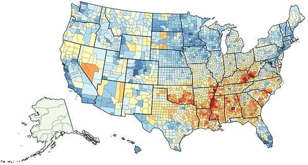
The results also offer a stunning picture of the country. The county-by-county data is pulled together in interactive maps online not only for poverty and life expectancy but also obesity, smoking, physical activity and hypertension. Users can pull up data by state for any county for a compelling look at that area’s health for both men and women going as far back as 1996. It’s fairly easy to navigate, but the New York Times’ version using life expectancy data, included in Sanger-Katz’s piece, shows at-a-glance the stark health gaps across the nation. It’s not hard to see the dark areas pointing to areas with high income inequality concentrated in the South but also peppering the rest of the country. Users can also roll over counties for exact data and income dollar amounts.
Other related data from the project, a collaboration with the Robert Wood Johnson Foundation, is also included online.
Still, there’s no clear reason behind the shorter life spans found by researchers, who analyzes data from the Census Bureau’s Small Area Income and Poverty Estimates. Sanger-Katz discusses possible theories, from the impact of money to stress. But her final key point, looking at the numbers, make the gap clear:
Here’s what that means in some real counties. The researchers compared the adjoining Park and Fremont Counties in Wyoming. Both have relatively small populations and are predominantly white. Both include parts of large national parks. But the Fremont inequality ratio is 4.6, compared with Park’s 3.6. And, in Fremont County, there are 13 years of potential life lost for every 1,000 residents, compared with only 7.5 in Park.